Social Media Image Sizes in 2026: A Practical Creator Guide
Use practical image dimensions and aspect ratios for YouTube, Instagram, TikTok, Facebook, and LinkedIn without rebuilding every design.
Why image size still matters
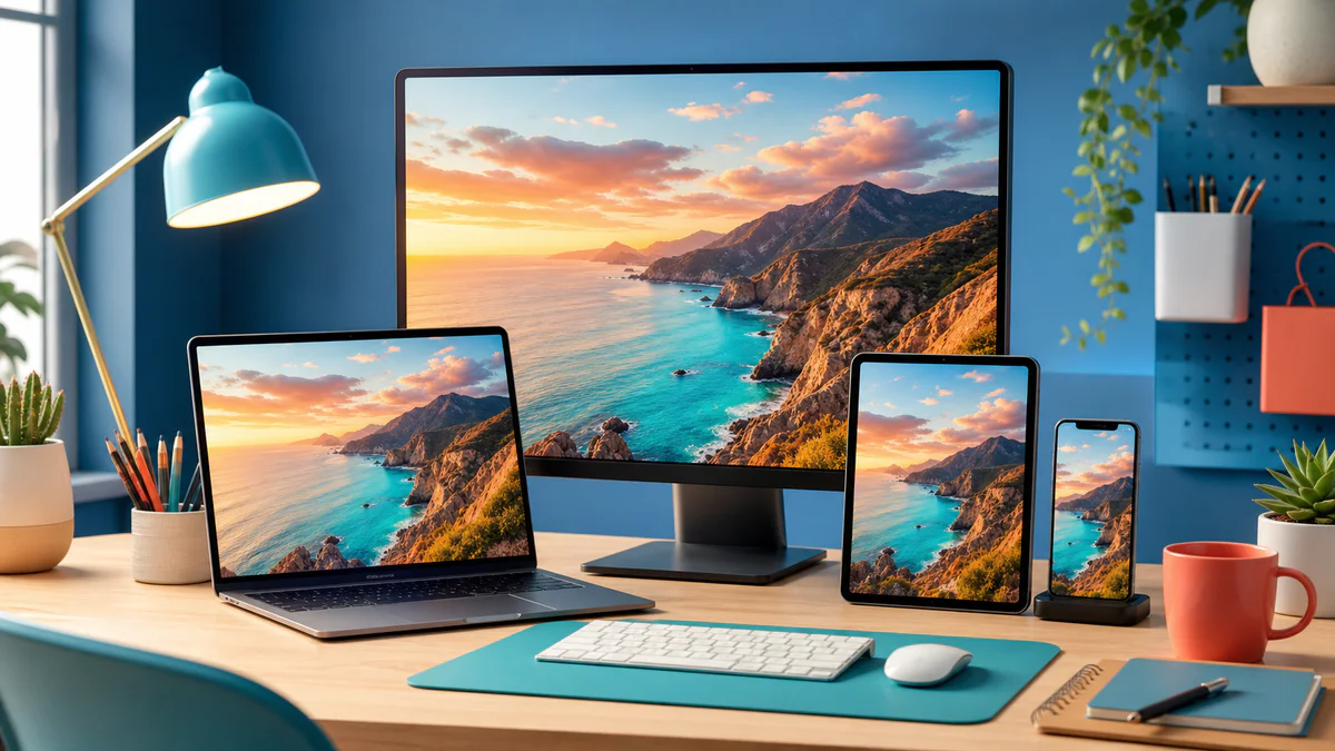
An image can look sharp in your editor and still appear soft, awkwardly cropped, or unreadable after upload. Social platforms display the same asset in feeds, grids, previews, notifications, and mobile layouts. Each placement may crop the file differently. The safest workflow is to design for the intended aspect ratio, keep important details away from the edges, and export enough pixels for a clear result.
Dimensions change occasionally as platforms redesign their interfaces. Treat the sizes below as reliable working canvases, then preview the final upload before publishing. A platform may accept a larger file while displaying it at a smaller size.
Practical working sizes
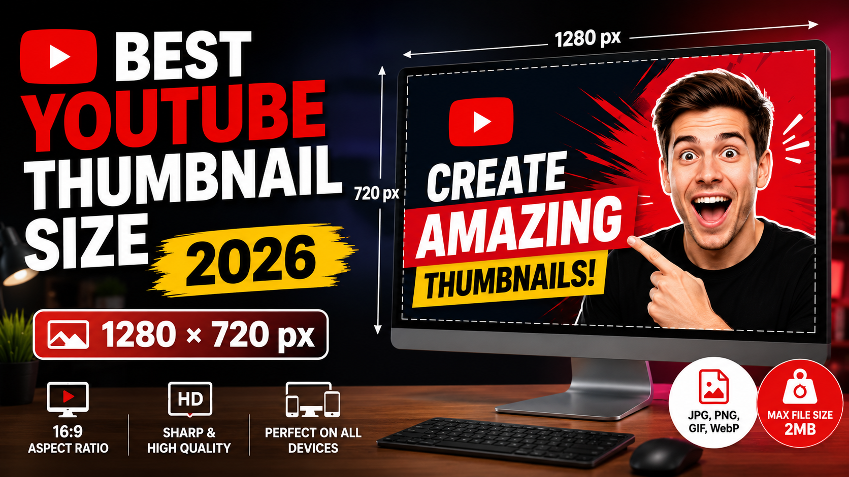
- YouTube thumbnail: 1280 × 720 pixels, 16:9
- Instagram square post: 1080 × 1080 pixels, 1:1
- Instagram portrait post: 1080 × 1350 pixels, 4:5
- Reels, Stories, and TikTok: 1080 × 1920 pixels, 9:16
- Facebook or LinkedIn landscape post: 1200 × 630 pixels, approximately 1.91:1
- Pinterest-style portrait graphic: 1000 × 1500 pixels, 2:3
These are creation sizes, not promises about how every interface will display an upload. Profile photos and banners deserve separate templates because circular crops, device widths, and interface overlays can hide content.
Build one design system instead of many unrelated graphics
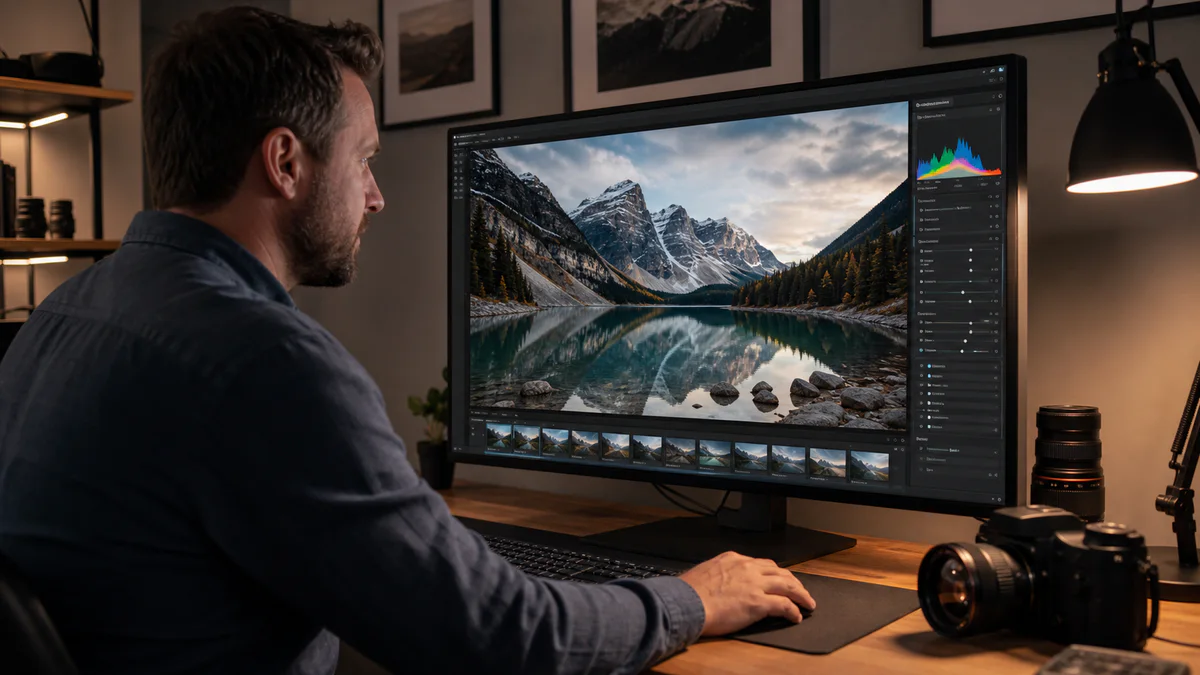
Start with a high-resolution source image and a small set of reusable canvases: landscape, square, portrait, and vertical story. Keep a consistent color palette, type hierarchy, and subject treatment across all four. This is faster than stretching one finished graphic into every shape.
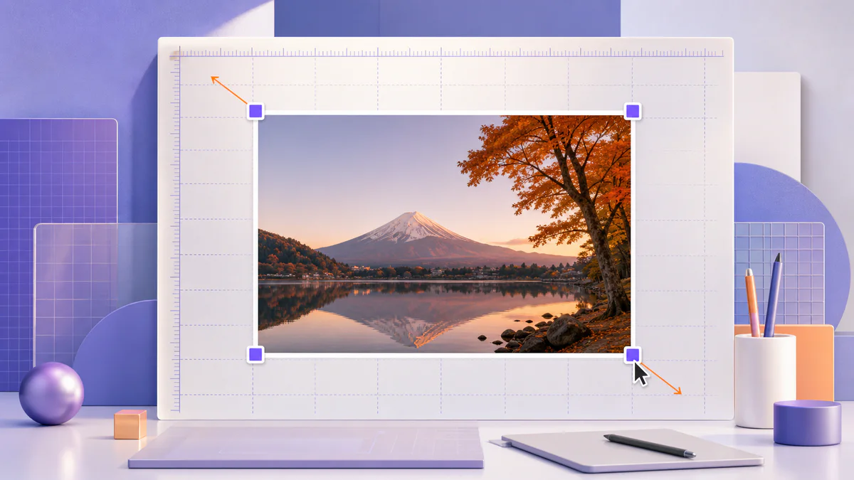
Use the Pixores image resizer to create the required pixel dimensions, but remember that resizing and cropping solve different problems. Resizing changes the number of pixels. Cropping changes the composition. If the aspect ratio changes, use the online crop tool to reframe the subject instead of forcing the image to stretch.
Protect the safe area
Place faces, logos you own, and essential text near the visual center. Leave breathing room around the outside edge, especially in vertical video covers where interface buttons and captions occupy part of the screen. For thumbnails, check the design at a very small size. If the message disappears when the image is reduced, simplify it.
Choose an export format
JPG is a practical choice for photographs and complex gradients. PNG is useful for graphics that need transparency or very crisp flat shapes. WebP can produce smaller files for websites, although some social publishing workflows still prefer JPG or PNG. Read JPG vs PNG when the visual difference is more important than the extension.
A reliable publishing checklist
- Confirm the canvas ratio before designing
- Keep key content away from edges and overlays
- Crop each composition intentionally
- Export in RGB color
- Inspect the file on a phone before publishing
- Save an editable master for future platform changes
Final recommendation
Do not chase every possible display size. Create strong masters in four common ratios, adapt the composition deliberately, and preview each upload. This approach keeps your brand consistent and makes future updates much easier. Explore all Pixores image tools when you need to crop, resize, compress, or convert an asset.