How to Create a YouTube Thumbnail: A Practical Design and Testing Guide
Build a clear YouTube thumbnail at the correct size, test its mobile readability, export it cleanly, and improve it with evidence instead of guesswork.
A useful YouTube thumbnail does two jobs at once: it communicates the subject of the video and gives the intended viewer a truthful reason to look closer. Decoration comes after clarity. This guide combines dimensions, composition, export checks, accessibility, and testing into one repeatable workflow that you can use in Pixores or another layer-based editor.
Start with the promise of the video
Write one sentence that describes what a viewer will receive from the video. A tutorial might promise a finished result, a comparison might promise a decision, and a documentary might promise a story. The thumbnail should visualize that promise without claiming something the video never delivers.
Before opening an editor, answer these questions:
- Who is the video for?
- What is the one subject that must remain recognizable on a small phone screen?
- Which detail creates useful context rather than empty mystery?
- Can the idea be understood without reading the title?
The video title and thumbnail should cooperate instead of repeating the same sentence. If the title already names the subject, the image can show the result, conflict, scale, or transformation.
Use the correct canvas and safe composition
YouTube currently recommends uploading the highest-resolution 16:9 thumbnail possible and specifically lists 3840 by 2160 pixels, with a minimum width of 640 pixels. Its current file-size limits also depend on how you upload: video thumbnails can be up to 2 MB on mobile and 50 MB on desktop. Requirements can change, so verify consequential upload rules in YouTube's official thumbnail documentation.
Pixores opens with a practical 1280 by 720 preset. That remains a valid 16:9, 720p working canvas, while a custom 3840 by 2160 canvas follows YouTube's current highest-resolution recommendation when your source assets and upload workflow support it. Do not enlarge a tiny image merely to reach the larger number; use the cleanest original available.
Keep essential text, faces, and logos away from the outer edge. YouTube may display duration badges and interface controls over parts of the thumbnail. A practical check is to leave comfortable space around all four sides and avoid placing important information in the lower-right corner.
Build a hierarchy that survives at mobile size
Start with one dominant subject. Enlarge it until its silhouette or expression is readable when the entire thumbnail is only a few centimeters wide. Use the background to support separation, not to compete for attention.
A reliable layer order is:
- A simple background or scene that establishes context.
- One primary subject with a clean outline.
- One supporting object, result, or before-and-after cue when it is necessary.
- A short text label only when the image cannot communicate the distinction alone.
- Subtle finishing adjustments such as contrast, shadow, or color balance.
Zooming in while editing can hide clutter. Export a draft, display it around 160 pixels wide, and ask someone unfamiliar with the project what they notice first. If the answer is not the intended subject, change the hierarchy rather than adding more elements.
Write thumbnail text for recognition, not explanation
Text is optional. When it adds value, keep it short and make each word earn its space. Use a typeface with sturdy shapes, sufficient spacing, and strong contrast against the local background. A stroke or shadow can help on a changing background, but it cannot rescue text that is too small.
Avoid vague phrases such as “You won't believe this” when a specific visual label would be more useful. Do not cover a person's eyes, a product result, or another high-information area with text. Check spelling in the exported file, not only in the editor.
Use color to separate information
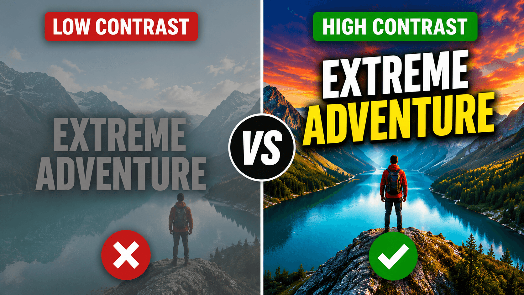
Contrast is more important than choosing a supposedly “viral” color. A warm subject can separate from a cooler background; a light subject can separate from a dark field. Limit the palette so viewers can identify the focal point quickly.
Review the design in grayscale. If the subject and text disappear into the background, their brightness values are too similar even if the colors look different. Also check that meaning does not depend only on red versus green or another combination that some viewers may not distinguish.
Prepare source images carefully
Use the highest-quality source you legitimately own or have permission to use. Crop around the intended gesture or object before performing aggressive enhancement. If you remove a background, inspect hair, transparent objects, product edges, and gaps between fingers on both light and dark test backgrounds.
Upscaling can make a small source easier to place, but it cannot recover facts that were never captured. Treat newly synthesized detail as an approximation and avoid using enhancement to misrepresent products, evidence, or people.
Build the thumbnail in Pixores
Open the Pixores Thumbnail Maker and choose the 1280 by 720 preset or enter a custom 3840 by 2160 canvas for YouTube's current highest-resolution recommendation. Import your background and subject as separate layers so each can be positioned and adjusted independently. Add text only after the visual hierarchy works without it.
Before export:
- Confirm the canvas is 16:9 and the subject is not stretched.
- Check important details at small preview size.
- Hide guides, selection boxes, and temporary layers.
- Verify that every visible asset may be used in the published video.
- Export a clean PNG when sharp graphics dominate, or a high-quality JPG when a photographic design must stay compact.
- Confirm the final file opens correctly and remains within YouTube's upload limit.
Test one meaningful variable at a time
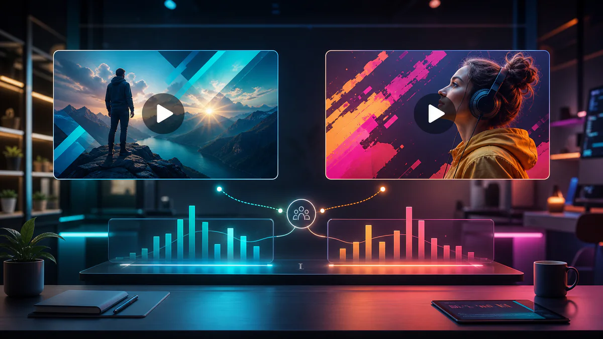
Thumbnail improvement requires a clear comparison. Create version B by changing one major variable: the main image, crop, text treatment, or composition. If every element changes, the result cannot tell you what caused the difference.
Use YouTube's native testing features when they are available for your channel. Evaluate watch time and viewer satisfaction alongside click-through rate. A misleading image may earn an initial click and still produce a poor viewing session. The winning thumbnail should attract the right viewer to the video it accurately represents.
For a detailed experiment design, continue with YouTube Thumbnail A/B Testing. For palette decisions, use the evidence-based checks in Thumbnail Color Psychology.
Final quality checklist
- The image accurately represents the video.
- One subject is identifiable at mobile size.
- Text, if present, is brief and readable.
- The title and thumbnail add different information.
- Important elements avoid interface overlays and edges.
- The source assets are licensed or original.
- The file dimensions, format, and size meet current YouTube requirements.
- The exported file was opened and reviewed before upload.
A strong thumbnail is not a collection of tricks. It is a compact piece of visual communication that sets an honest expectation, survives a small display, and improves through controlled testing.
Reproducible field check
The 160-pixel recognition check
Verify that the thumbnail communicates one honest subject at approximately mobile-feed size.
Procedure
- Export the finished thumbnail and a second version with one meaningful change.
- Display both at 160 pixels wide without showing the video title.
- Ask a reviewer to identify the subject, first focal point, and expected video topic.
Record these observations
- Version tested
- First element noticed
- Topic inferred
- Unreadable text or hidden details
Pass condition: A reviewer identifies the intended subject and topic without zooming or relying on a misleading cue.