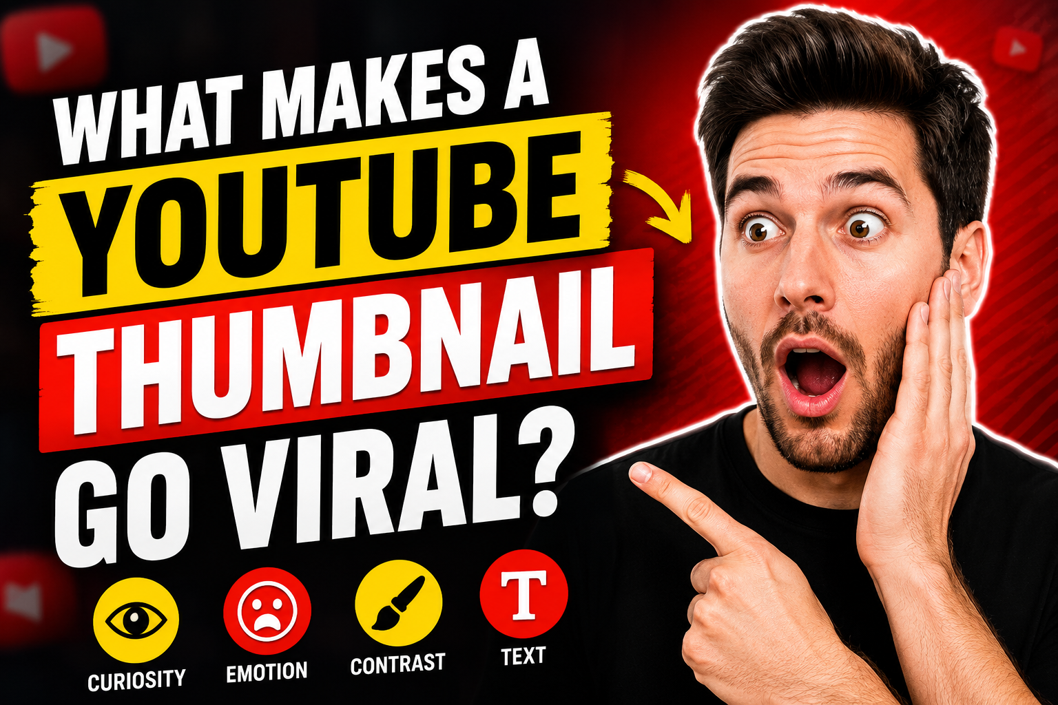
Thumbnail Color Psychology: How to Create Clearer Visual Contrast
Use color, contrast, and hierarchy to make YouTube thumbnails easier to understand without relying on exaggerated claims.
Color supports the message
Color can guide attention, separate a subject from the background, and help a series of videos feel connected. It cannot rescue a confusing idea. A strong thumbnail starts with one clear visual promise, then uses color to make that promise easy to recognize at a small size.
Color associations are influenced by culture, context, and personal experience. Red does not automatically create urgency, and blue does not guarantee trust. Treat common associations as creative hypotheses to test, not universal psychological laws.
Begin with contrast
The most important subject should be easy to distinguish from its surroundings. Contrast can come from brightness, saturation, hue, scale, or sharpness. A bright face against a dark background is one solution; a dark product on a pale field is another.
Convert the thumbnail to grayscale temporarily. If every element has a similar brightness, the composition may become muddy even when the colors are vivid.
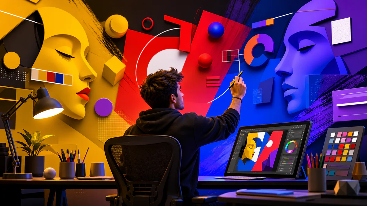
Use a limited palette
Two or three dominant colors are usually easier to control than a rainbow of competing accents. Choose a background family, a subject treatment, and one accent for the key detail. Reuse the same palette rules across a video series so viewers can recognize the visual system without every thumbnail looking identical.
Make text readable
Thumbnail text should be brief, large, and meaningfully different from the video title. Use strong contrast between text and its immediate background. A subtle shadow, solid shape, or outline can improve separation, but heavy effects often create noise.
Check the design at the size it appears in a mobile feed. The Pixores Thumbnail Maker lets you build the composition on a 16:9 canvas and adjust layers without flattening the design too early.
Avoid misleading color tactics
Extreme warning colors, fake notification marks, or urgent visual cues may attract attention, but they can also create the wrong expectation. The thumbnail should accurately represent the video. Sustainable performance comes from matching a strong visual with content that fulfills the promise.
Color combinations to explore
- Warm subject against a cool background
- Bright accent on a mostly neutral composition
- Complementary colors used with one clearly dominant
- Monochromatic background with a contrasting face or object
- Dark background with one high-luminance focal point
These are starting points. Test them against your subject, channel style, and audience rather than copying a palette blindly.
Build variations deliberately
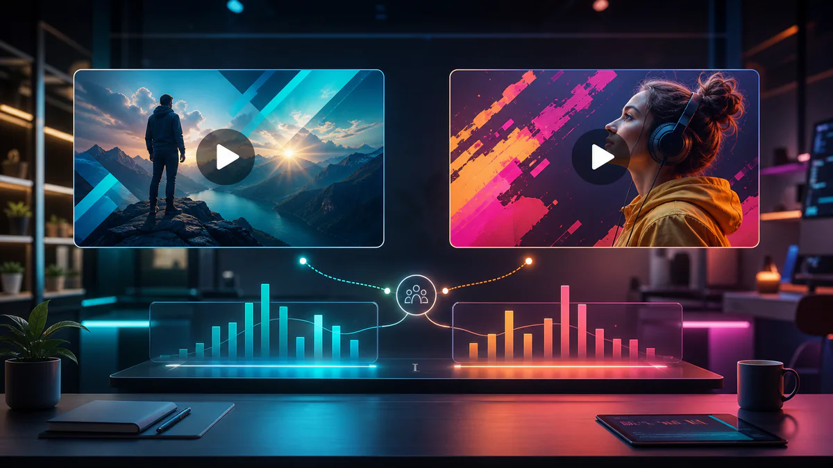
When comparing concepts, change one major variable at a time: background color, subject crop, accent color, or text treatment. If every element changes, you learn less from the result. The guide to thumbnail A/B testing explains how to plan useful variations.
Final recommendation
Use color to clarify hierarchy, not to manufacture emotion. Start with a strong idea, limit the palette, verify readability at small size, and keep the visual promise honest. For broader composition advice, read what makes a thumbnail more clickable.