How to Compress Images for Website SEO and Faster Pages
Learn a practical image compression workflow that improves page speed while protecting visual quality and accessibility.
Why images affect website performance
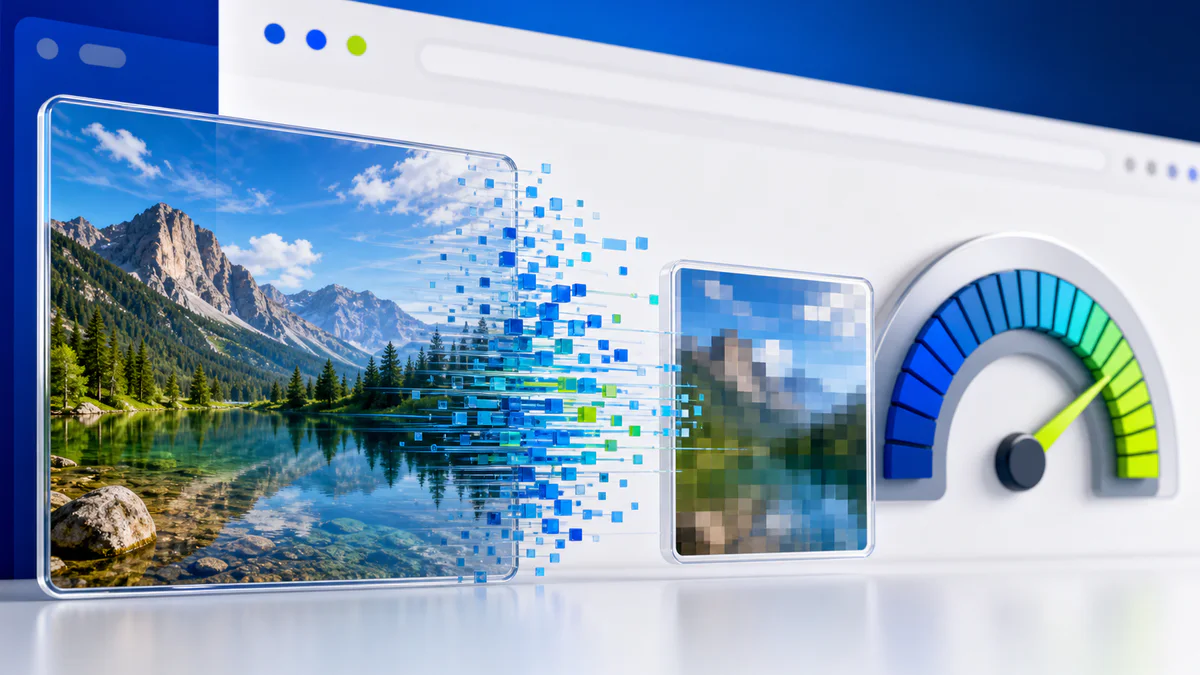
Images are often among the largest resources on a page. An oversized hero photograph can transfer more data than the surrounding HTML, CSS, and interface icons combined. Heavy pages take longer to load on slower connections and can feel unresponsive, especially on mobile devices.
Compression helps, but SEO is not a contest to produce the smallest possible file. The goal is a page that loads efficiently and still looks trustworthy. A visibly damaged product photo or portfolio image can cost more than the saved bandwidth.
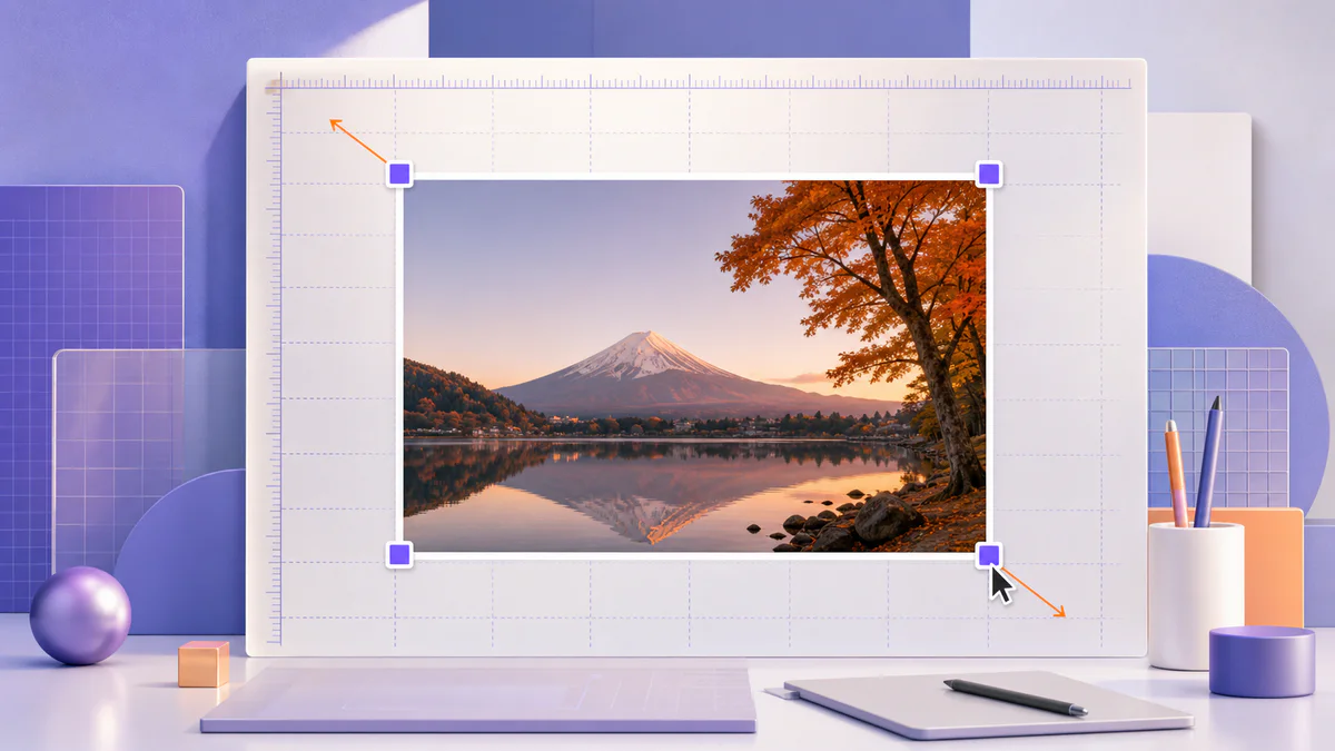
Resize before you compress
Do not upload a 5000-pixel camera image when the layout never displays it wider than 1200 pixels. First determine the maximum rendered size, then create an appropriately sized derivative. Use Resize Image to reduce the dimensions while preserving the aspect ratio.
High-density screens may benefit from an image larger than its CSS display size, but that does not justify serving the full camera original. Responsive image markup can deliver different files to different viewport sizes.
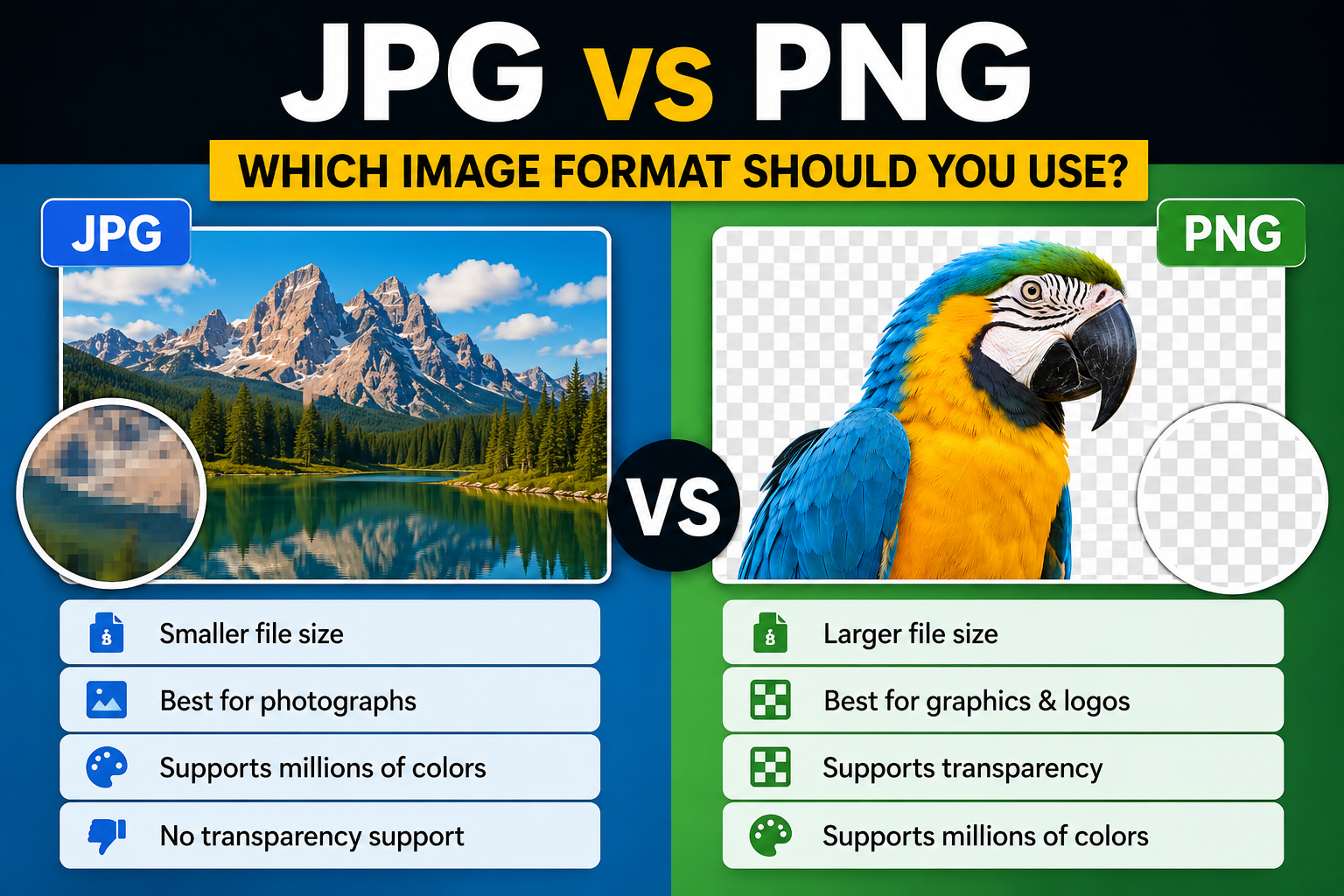
Choose the right format
JPEG works well for photographs and remains widely compatible. WebP usually offers a strong size-to-quality balance for modern websites. PNG is appropriate for transparency and crisp graphics but can be unnecessarily heavy for photographs. AVIF may deliver smaller files in some cases, although it should be tested with your tooling and fallbacks.
The comparison in WebP vs AVIF vs JPEG explains the tradeoffs in more detail.
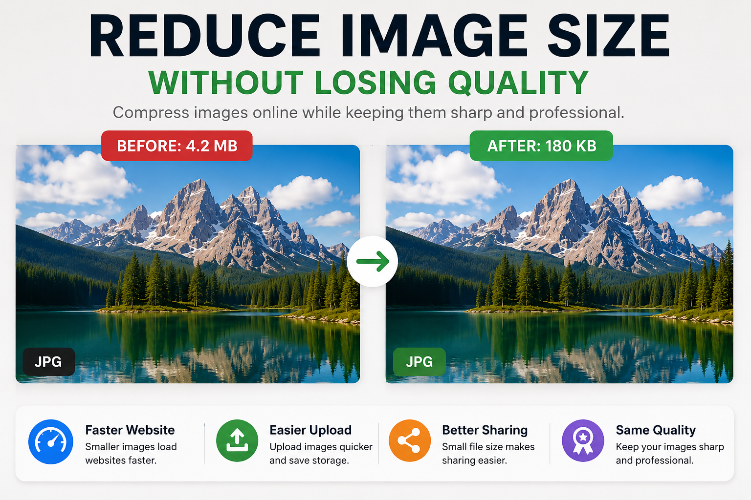
Compress with a visual target
Start with a moderate quality setting, then compare the original and output at 100 percent and at the actual display size. Look carefully at faces, hair, foliage, gradients, text, and high-contrast edges. These areas reveal compression damage first.
The Pixores image compressor is useful for producing a lighter copy. Keep the original separately so you can generate a different version later instead of recompressing an already compressed file.
Improve delivery, not only the file
- Add width and height attributes to reduce layout movement
- Use responsive images for different screen widths
- Lazy-load images below the initial viewport
- Prioritize the main above-the-fold image when appropriate
- Use descriptive alternative text when an image conveys information
- Cache stable image assets with sensible headers
Compression cannot repair a page that downloads the wrong dimensions or loads dozens of unnecessary files. Treat the file and delivery markup as one system.
Use descriptive filenames and alt text
A clear filename helps people manage assets and gives search engines context, but it is not a place for keyword repetition. Alternative text should communicate the image's purpose to someone who cannot see it. Decorative images can use empty alt text. Avoid stuffing every variation of a search phrase into either field.
A practical target
There is no universal maximum file size because a full-width photograph and a small icon have different jobs. Measure the page on a realistic mobile connection, identify the largest transfers, and optimize those first. Improvements should be judged by user experience and visual integrity, not an arbitrary number alone.
Final checklist
Resize, select the correct format, compress once from a quality master, deliver responsive variants, and verify the live page. That sequence produces more reliable results than repeatedly lowering quality until a tool reports a small file.